Stop monitoring. Start deciding.

UptimeAI needed a brand and digital experience that could clearly communicate a complex proposition: turning industrial expertise and fragmented operational data into faster, smarter decisions through AI. It had an incredibly strong product, but its brand and digital presence needed to better reflect the sophistication of the platform and the magnitude of the problems it was solving.
The audience presented a particular challenge: the brand had to resonate with both frontline industrial teams and C-suite decision-makers. Many of those buyers were already disenchanted with costly technology investments that resulted in sunk costs, time, and effort. We began with brand strategy and positioning, working closely with UptimeAI’s marketing team to clarify its audiences, messaging, and differentiation. That foundation informed a strategic visual identity overhaul, new website structure, and highly targeted messaging. We continue to support UptimeAI at pivotal moments—from conference presentations and executive materials to specialty animations and campaign assets.
We hired Craft and Root to handle UptimeAI's rebrand and new website and honestly couldn't have asked for a smoother experience. They came in with a clear process, communication was easy throughout and the turnaround was faster than expected without compromising the quality of the work, which was great by the way. Really happy with how it all came together.

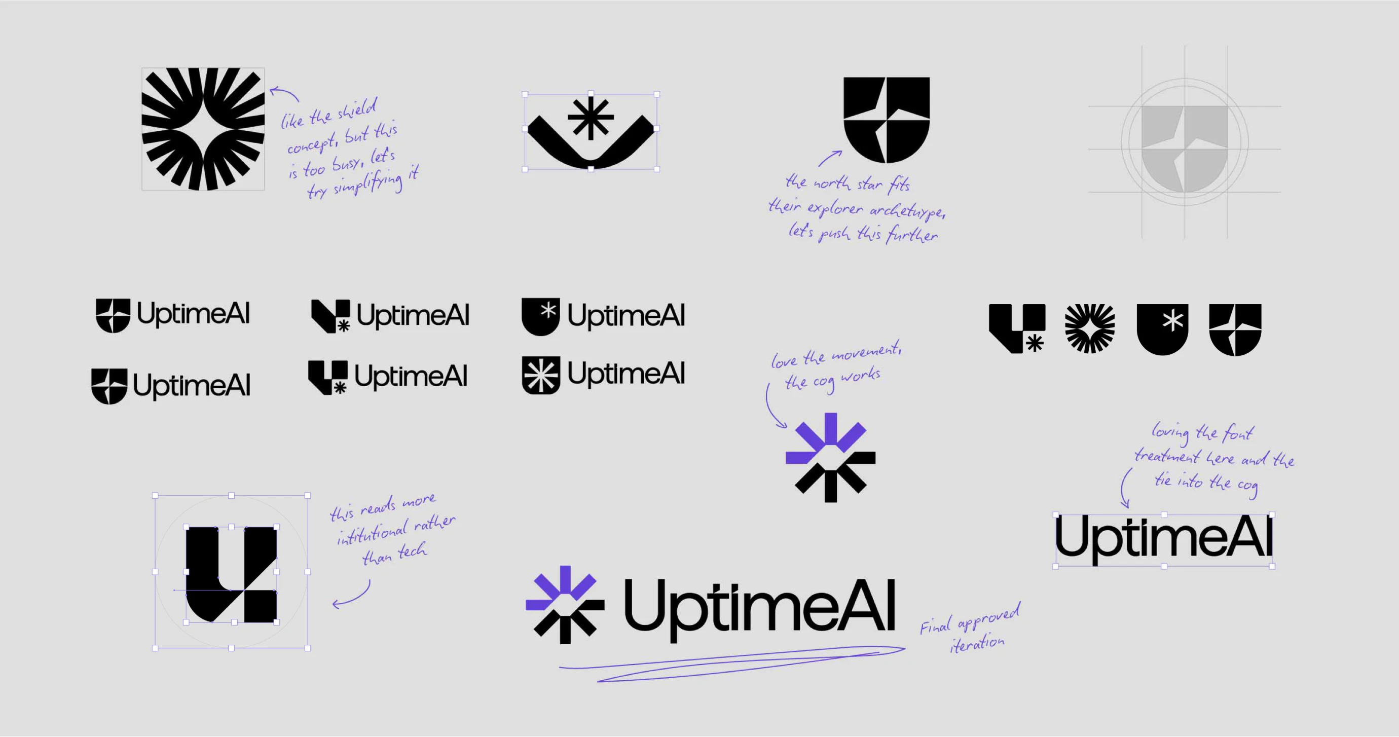
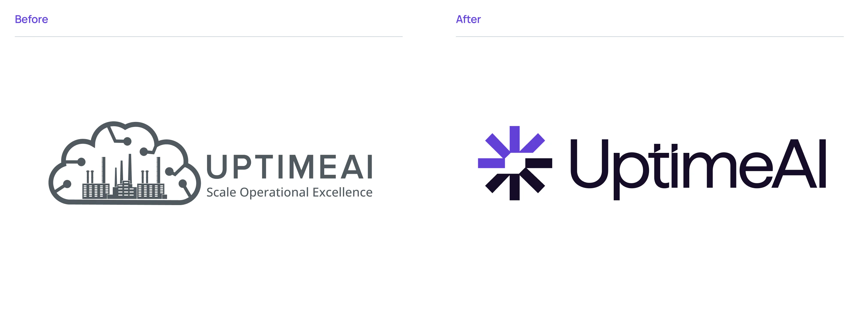
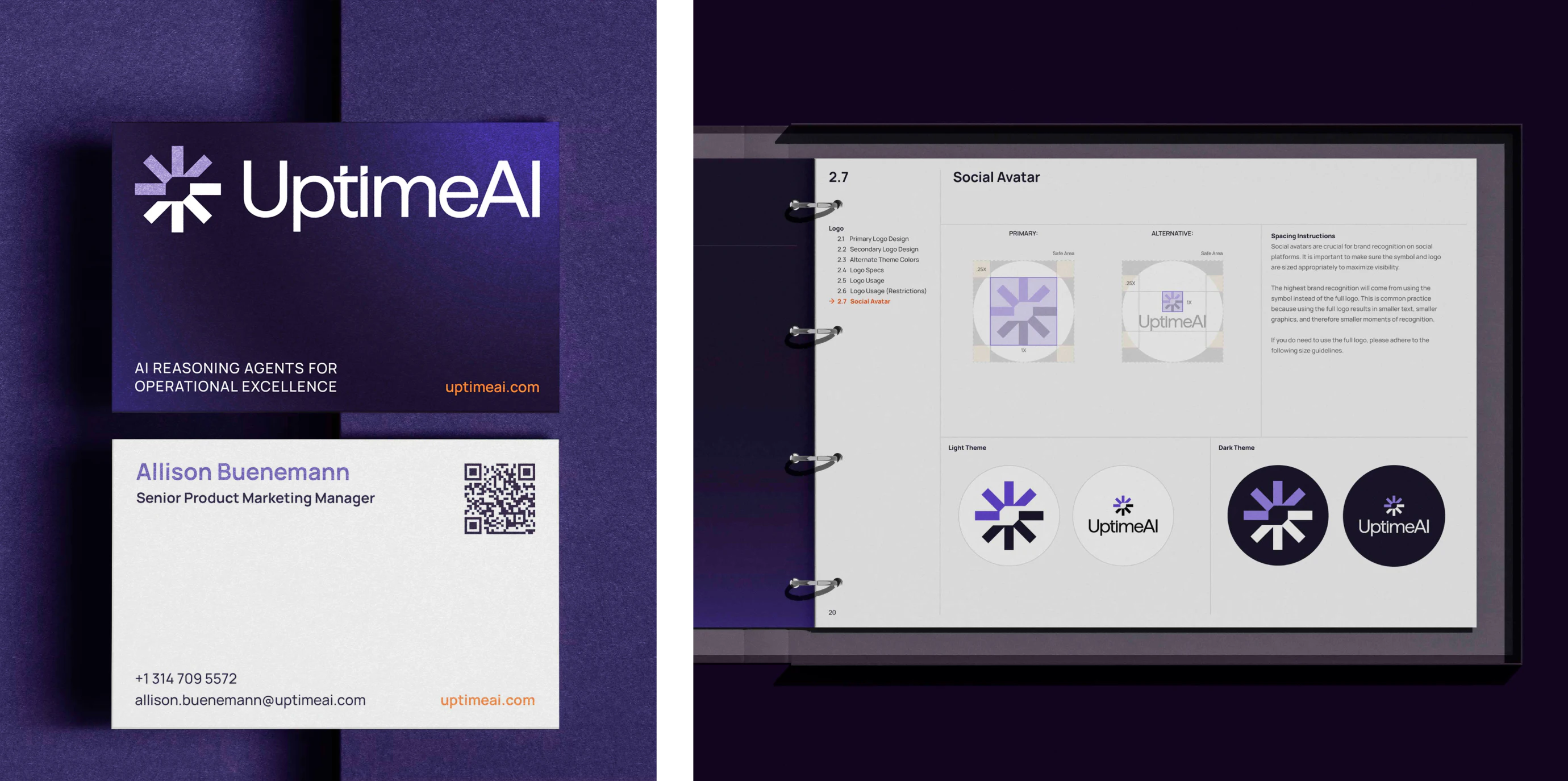
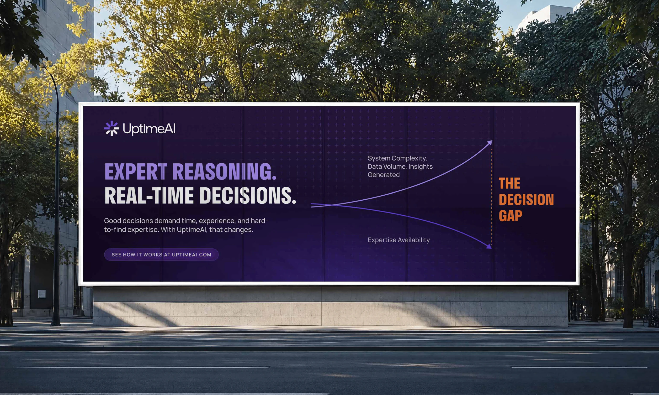
We evolved UptimeAI’s identity into a more confident and cohesive visual system, starting with a redesigned logo and extending it across color, typography, infographics, and motion.
Balancing technical precision with clarity and approachability, we created a flexible identity that performs consistently across digital experiences, presentations, animations, and really, all brand communications.


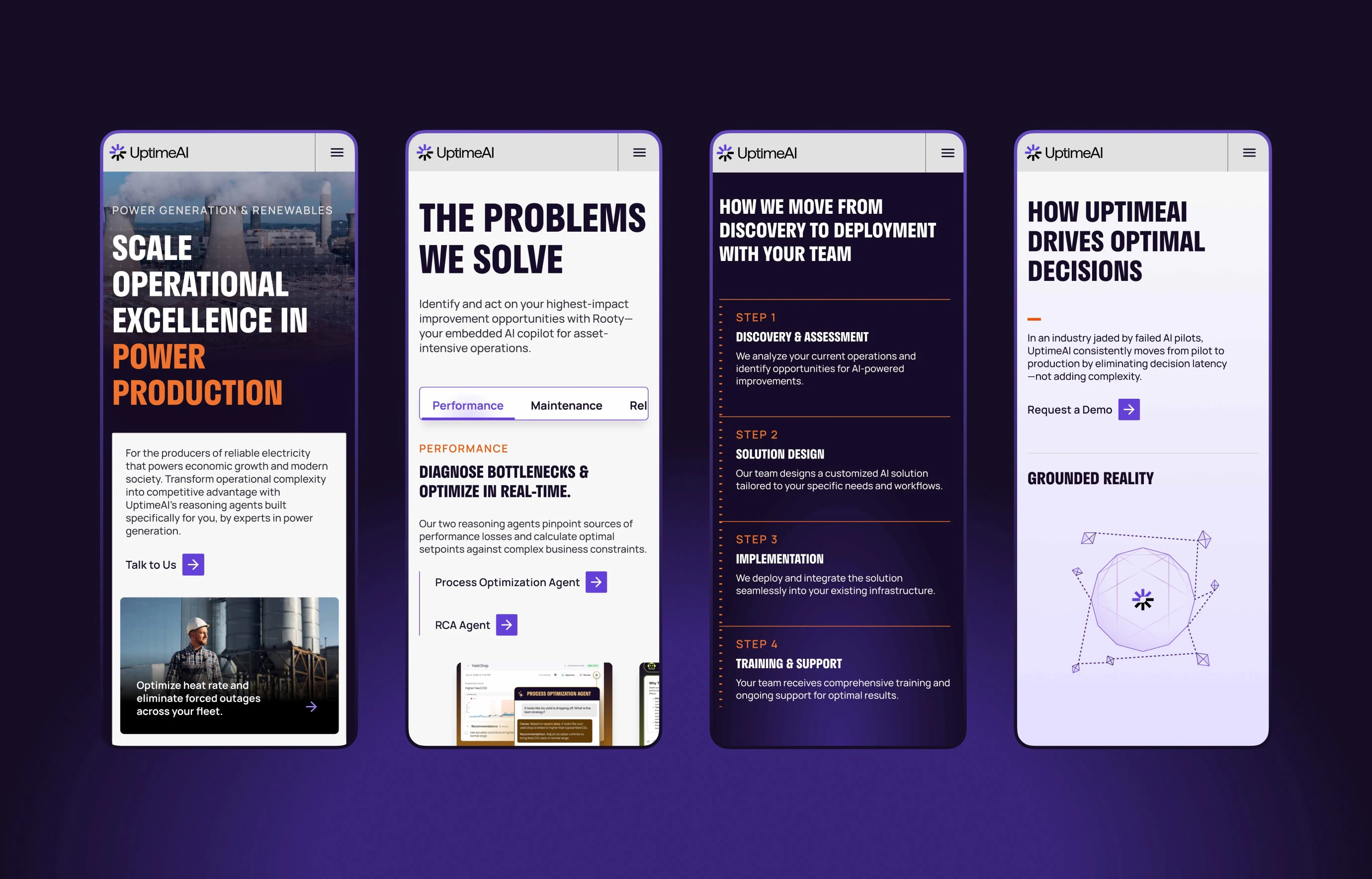
We completely reimagined UptimeAI’s website, from structure, narrative, and copywriting to wireframing, visual design, development, and purposeful motion.
Micro animations and interactions became an integral part of the experience, helping communicate complex ideas while making the brand feel intelligent and responsive. From subtle interface behaviors to animated grid systems across industry pages, motion helps guide users through UptimeAI’s technology and capabilities.
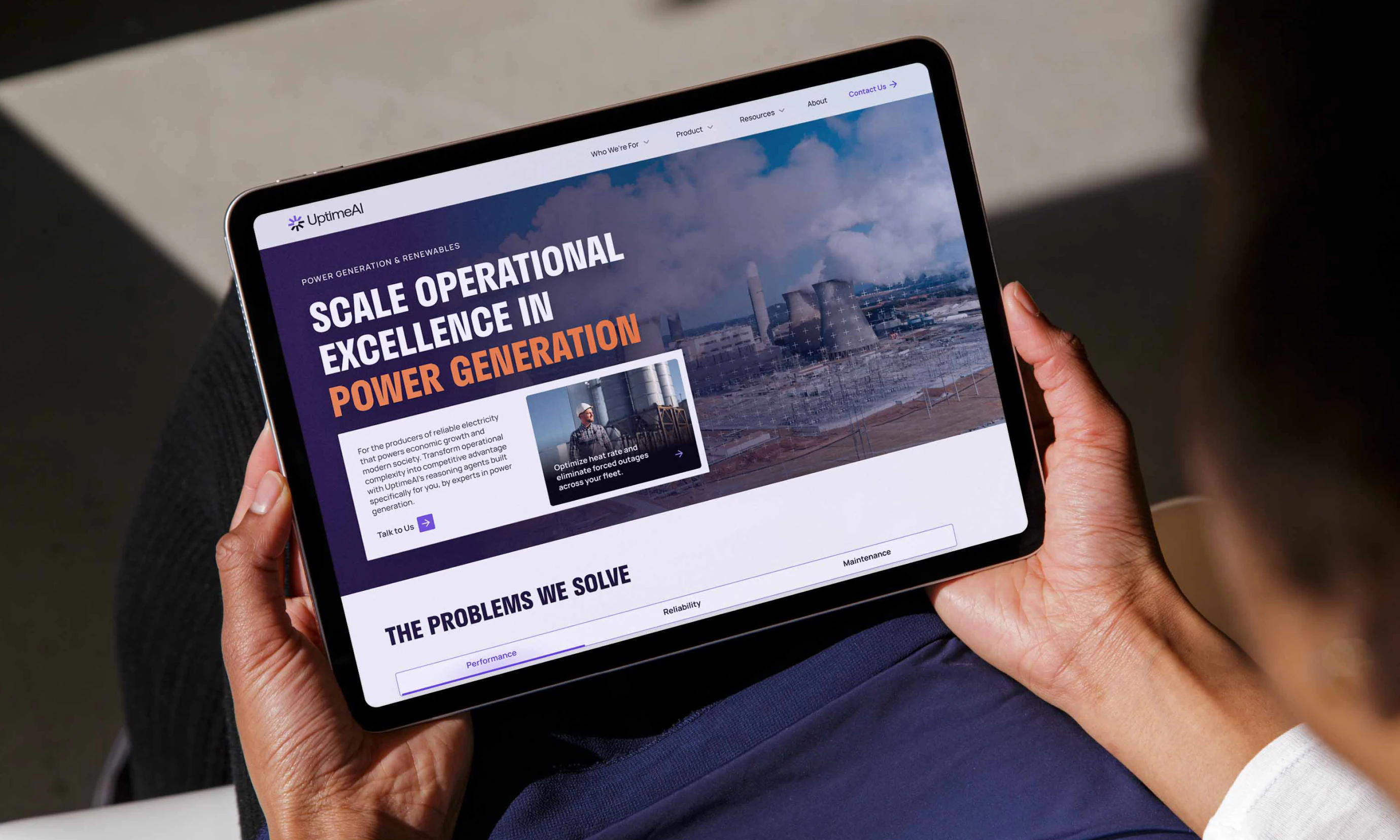
To make UptimeAI’s technology easier to understand, we extended the visual system into explanatory motion.
For the Agent Explainer Video, we transformed the client’s script into a complete visual narrative—from storyboard and animatic through to final animation.
Explore More Work
View All Case Studies- Edge CaseThe trusted technical partner for frontier technology, helping innovators in autonomous vehicles, robotics, aerospace and supply chain build safer, more reliable systems.
- Isometric TechnologiesBringing clarity to transportation performance through intelligent supply chain analytics and insights.

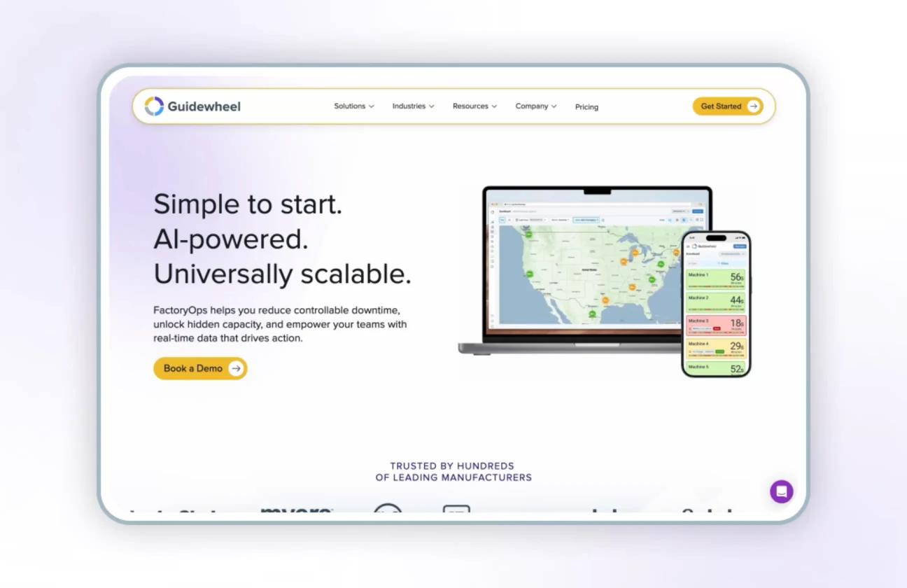
- GuidewheelEmpowering manufacturers with AI-powered insights that improve factory performance and operational efficiency.