Unlocking performance for every factory

Guidewheel delivers real-time visibility and control on the factory floor through a platform that brings world-class manufacturing within reach for any factory. By connecting machines to the cloud, it empowers teams to cut downtime, boost efficiency, and drive sustainable growth.
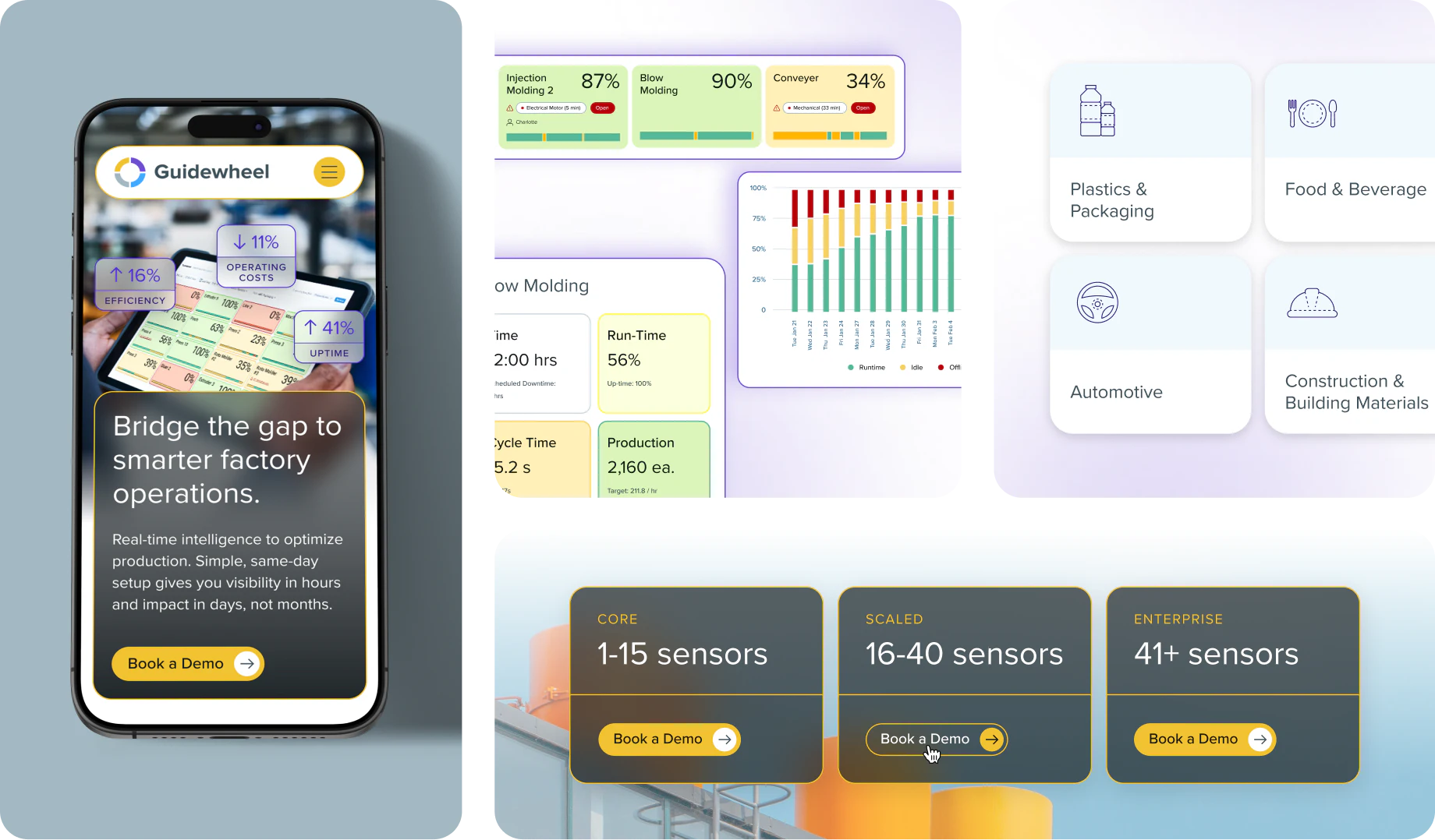
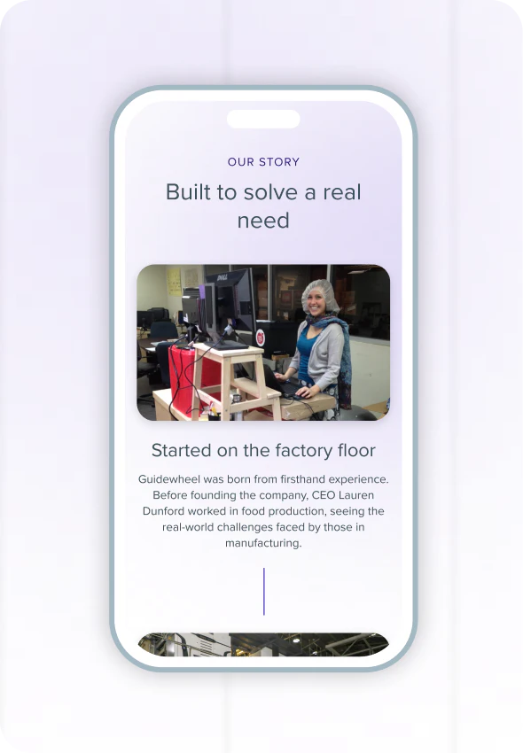
To reflect that spirit of innovation, Guidewheel partnered with us to elevate their brand identity and digital presence. We developed a unified system of custom iconography and polished UI graphics, then brought it all together through a redesigned website that translates the brand into a seamless digital experience. The result is a cohesive visual and digital system as dynamic, intuitive, and forward-thinking as their technology.
Being at a startup, working with this team feels like having an extension of OUR team. From concept to execution, they helped us design and build a beautiful website that elevates our brand and sets the tone for our next chapter.
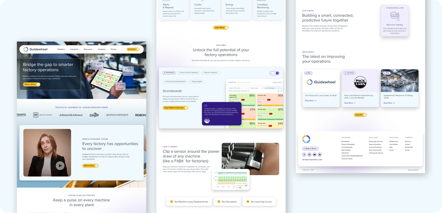
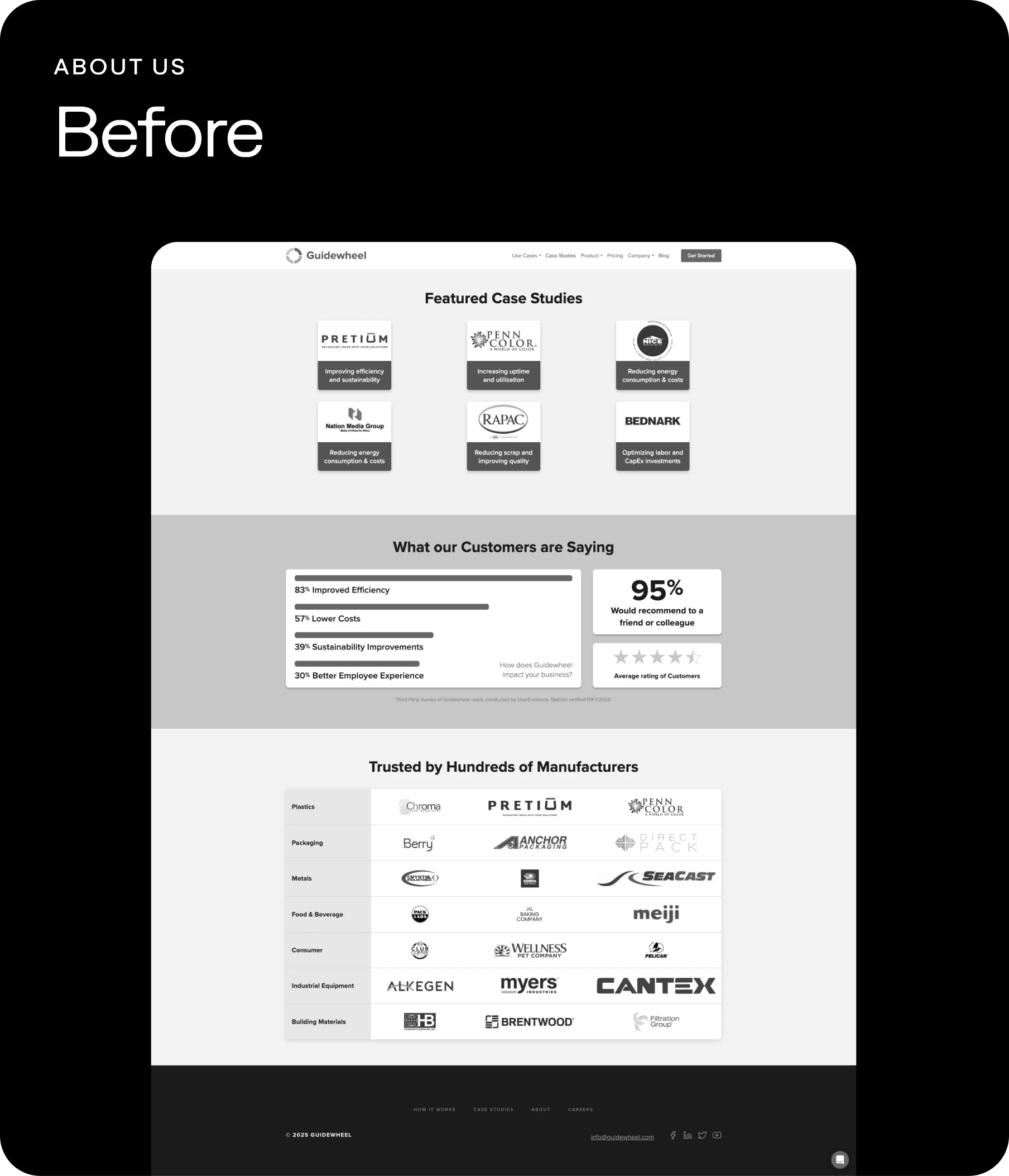
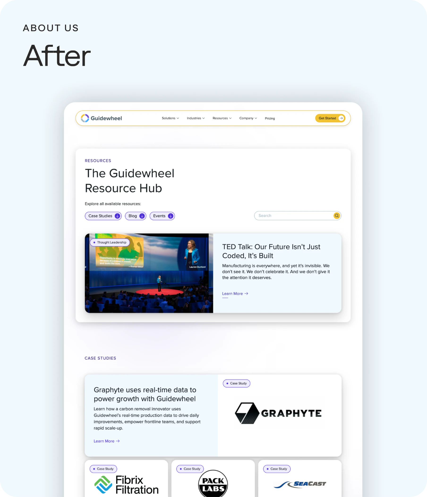
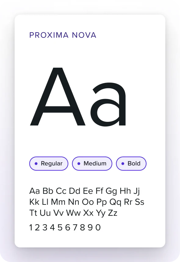
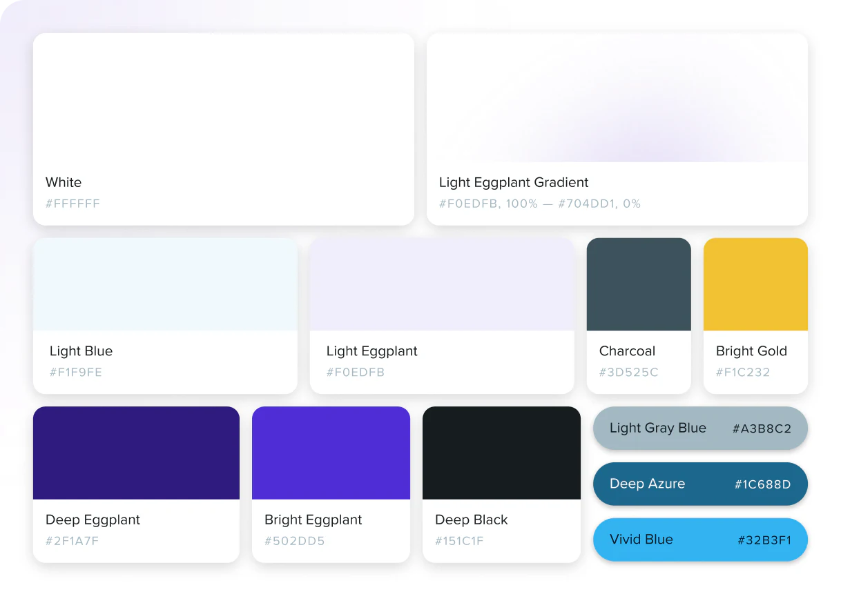
Guidewheel’s branding originally centered on a bold color palette and modest typography. By introducing soft gradients, subtle drop shadows, and vibrant color accents, we created a balanced system that feels dynamic yet sophisticated. To maintain continuity with the original identity, we kept Proxima Nova as the primary typeface, refining hierarchy and incorporating lighter weights for a more polished look.
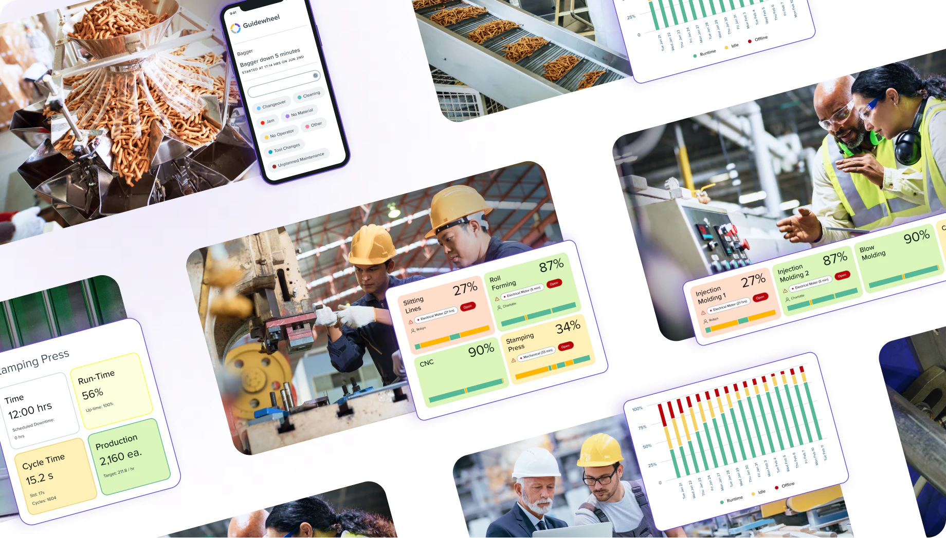
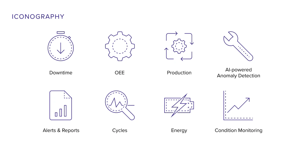
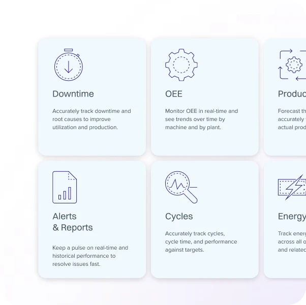
Iconography plays a central role in expressing Guidewheel’s core ideas. We refined the existing set and added bespoke designs, all unified by a cohesive style. With consistent line weights and perforated accents, the system achieves clarity and precision while remaining approachable.

Explore More Work
View All Case Studies- Edge CaseThe trusted technical partner for frontier technology, helping innovators in autonomous vehicles, robotics, aerospace and supply chain build safer, more reliable systems.
- Isometric TechnologiesBringing clarity to transportation performance through intelligent supply chain analytics and insights.

- 9th GearModernizing institutional payments through real-time settlement and intelligent financial infrastructure.